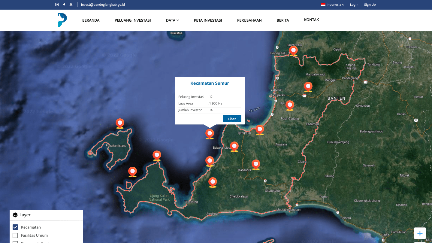
Pandeglang Invest
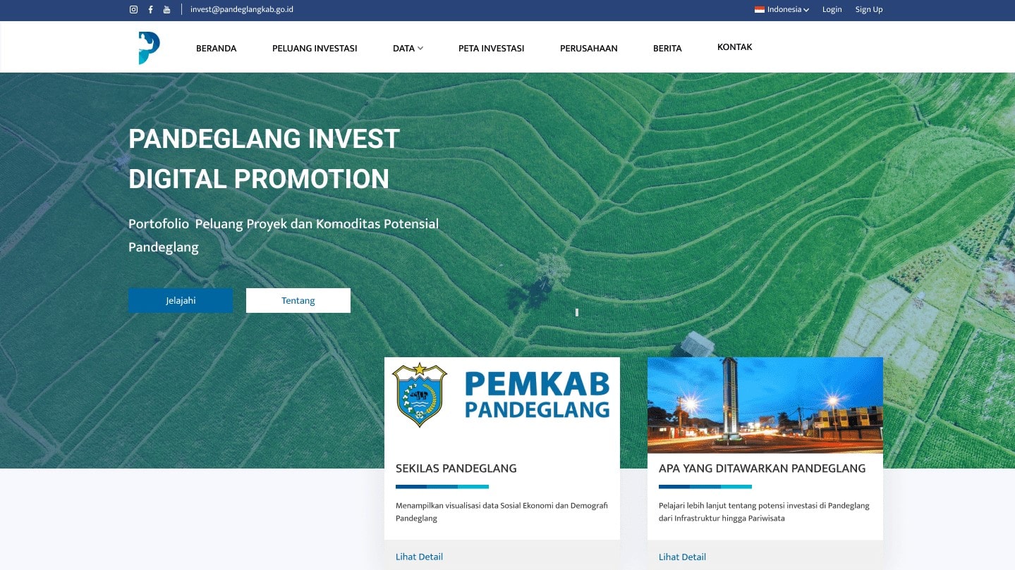
Digital Promotion Website for Potential Comodities Investment in Pandeglang
PROJECT OVERVIEW
The Product
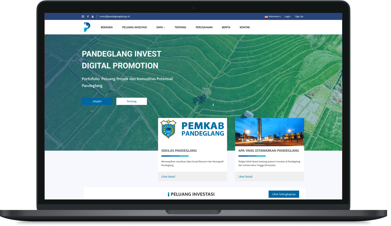
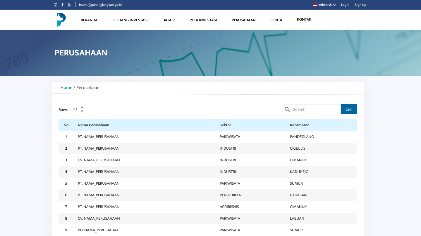
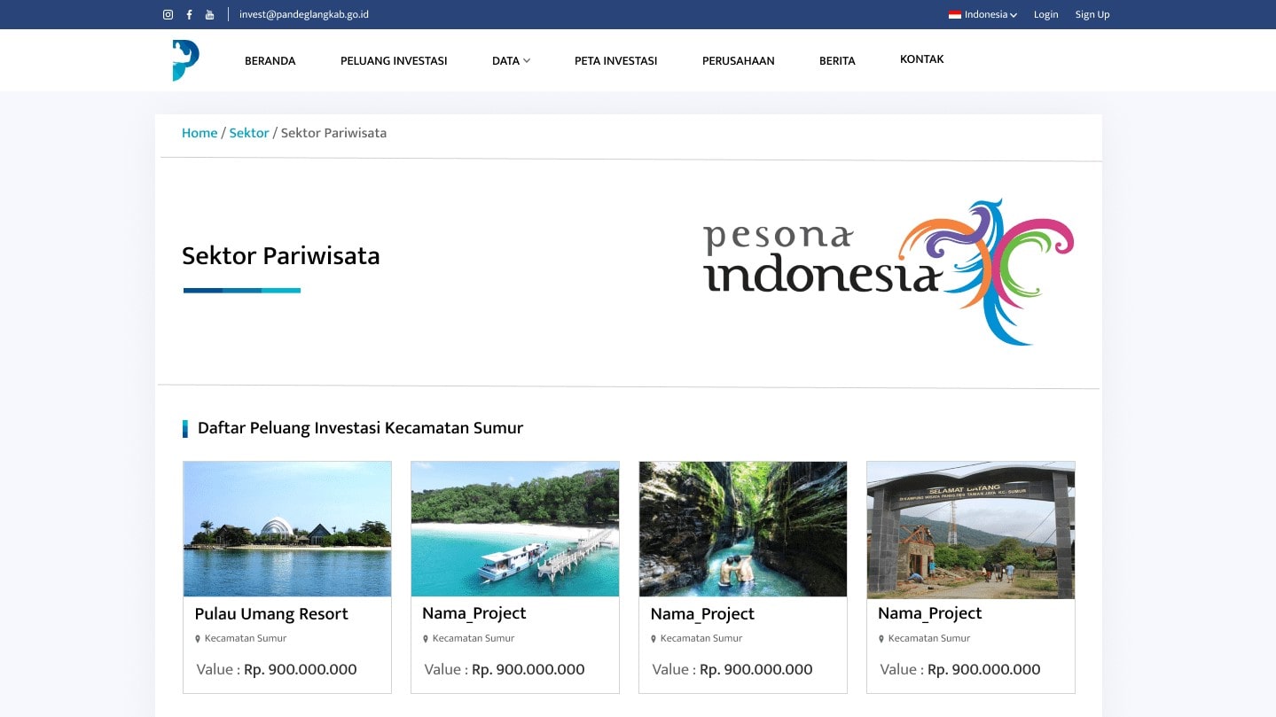
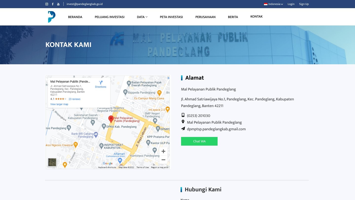
Pandeglang Invest is a website for promoting digital potential and investment opportunities available in Pandeglang district. This website provides a list of investment opportunities from various sectors and sub-districts. Therefor, with the creation of this website concept, it will increase the interest of potential investors and expand the reach of promotions with this digital website-based promotion platform.
The Problem
Based on data from Banten Province Investment, Investment realization in Quartal 1 of 2021 reached around Rp. 31.4 trillion. With such huge investment potential, unfortunately Pandeglang Government still doesn't have a platform or forum for digital promotion information related to potential investment sector online-based
UNDERSTANDING THE USER
User Research: Summary
This user group confirms the initial assumption, but research also revealed that there is no information-center was not the only factor users or investors do not receive information about potential investments in Pandeglang. There are also other problems such as interest, target area-investor scope, networking as well as challenges that make it difficult for users to receive information about the Pandeglang area.
User Research: Pain Points
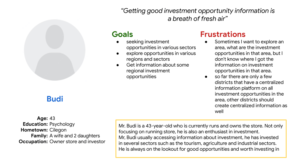
- Centralized-information, No platform information center for Investor to get information from Pandeglang area
- Location, Investors need specific invest opportunities location
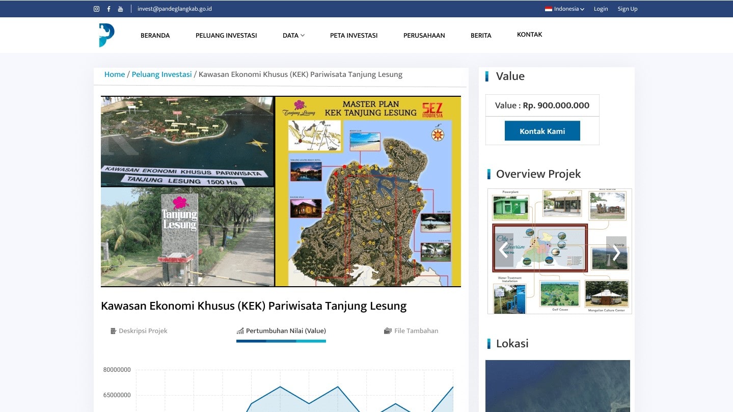
- Chart, Investors need visualization growth information
User Persona
STARTING THE DESIGN
User Flow
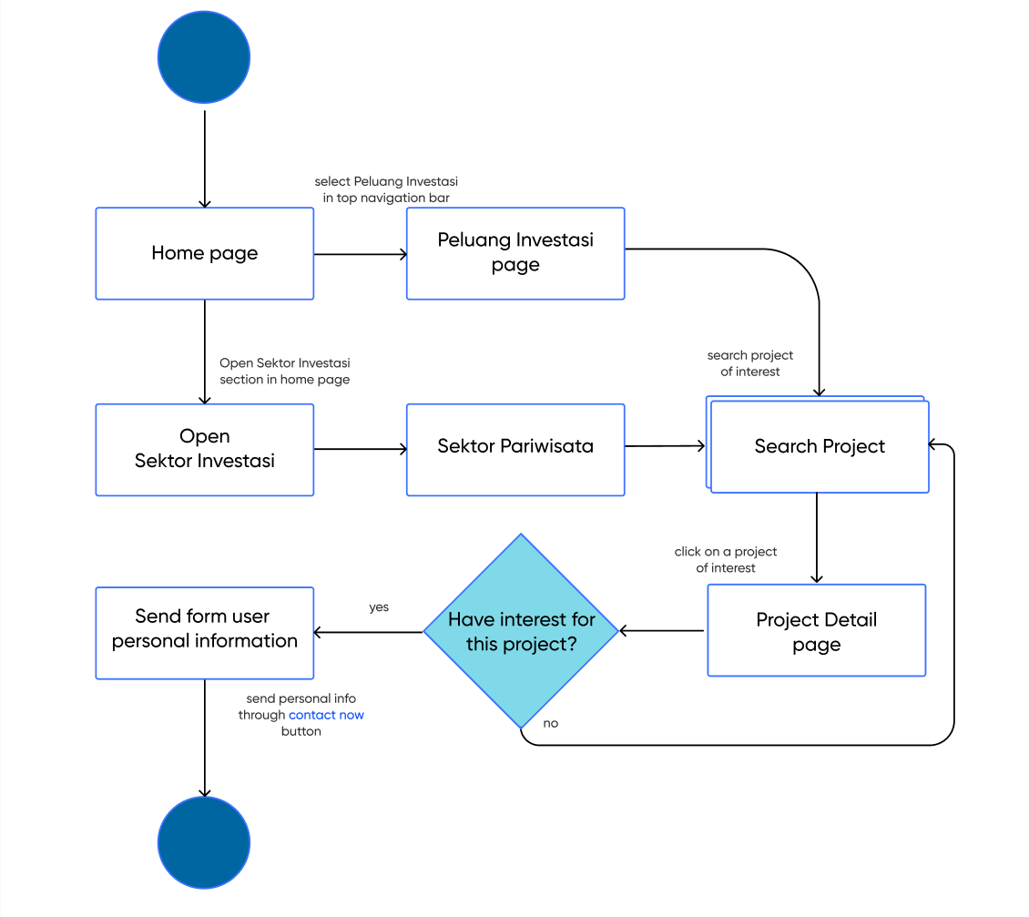
Case: an investor wants to invest in Pandeglang district. He wants to see the available investment opportunities and wants to target investment in tourism.

Sitemap

Digital Wirefames & Low-Fidelity Prototype
As the initial design phase continued, I made sure to base screen design on feedback and findings from the user research. Then I connected all of the screens involved in the primary user flow

Usability Study: Parameters
- Study Type: Unmoderated Usability Study
- Participants: 5 Participants
- Location: Indonesia
- Length: 15-20 Minutes
Usability Study: findings
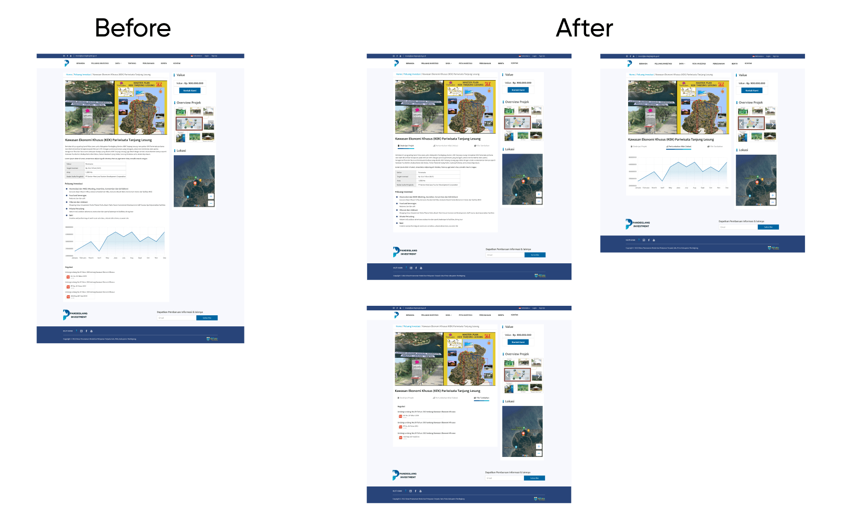
- Sub-menu in detail Potential Invest, Users confused too many scroll when access detail potential invest
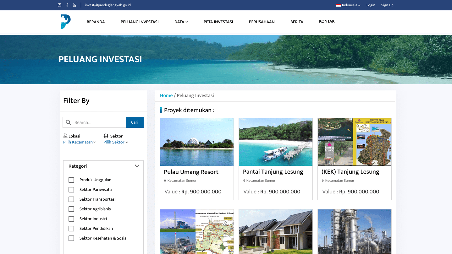
- Search-filter, Users want to filter what they’re looking for
REFINING THE DESIGN
Refine
Add sub-menu in detail peluang investasi
Mockups
Design Component Style
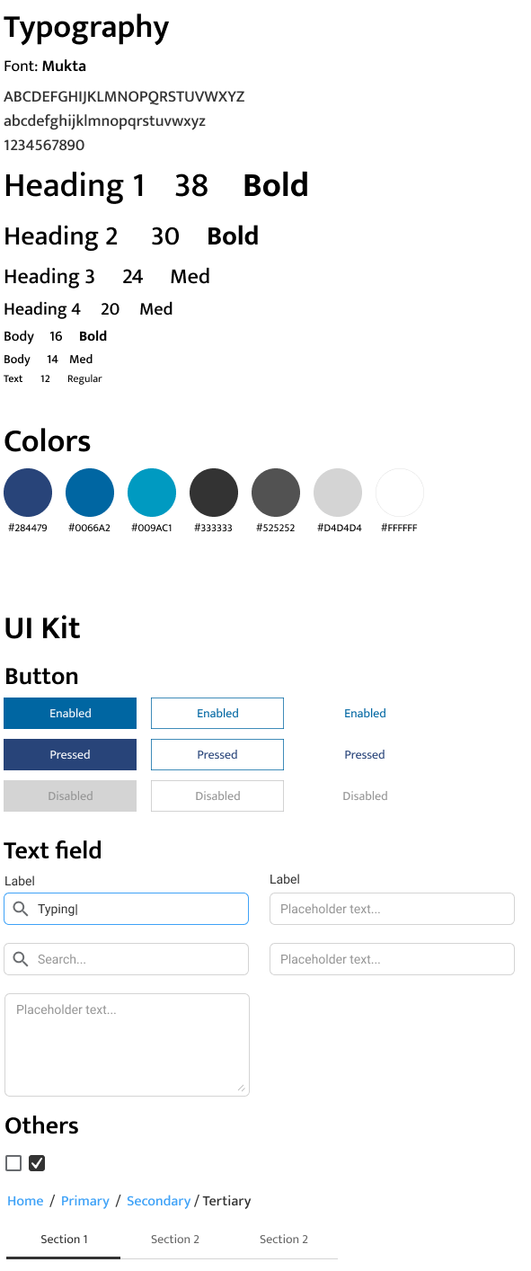
Accesibilty Consideration
- Used icons to help make navigations easy to understand
- provided access to users who are vision impaired through making the app suitable for use with screen readers
High Fidelity Prototype
Hi-fi prototype followed the same user flow as the lo-fi prototype, and included the design changes made after the usability study, as well as several changes suggested by members of my team
Click here to try Prototype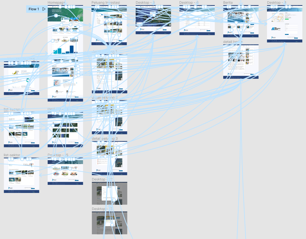
GOING FORWARD
Impact
The website makes users feel like the centralized-information web really thinks about how to meet their needs and easy to use. one quote from user feedback:
This is information place we’re looking for
Budi
Investor
What I Learned
while designing the app, I learned that the first few idea might not be the final ones. The feedback from peer reviews and the usability studies really influenced the final design
Next Steps
- Conduct more user research to determine any new areas of need
- Conduct another round of usability studies to validate whether the pain points users experienced have been effectively addressed
Project information
- Project Duration March 2021 - May 2021
- Role UX Researcher, UX Designer, UI Designer
- Responsibilities Conducting interviews, paper and digital wireframing, low and high-fidelity prototyping, conducting usability studies, accounting for accessibility and iterating on designs
- Try Prototype

