Moviticks
Movie Ticket Booking App
PROJECT OVERVIEW
The Product
Moviticks is a Movie Ticket Booking website for booking seats and purchase tickets to watch movies at a cinema. Users can choose various films that are currently showing in various theaters. The target users of this application are teenagers to adults which makes it easy for them to order cinema tickets on the sidelines of their busy lives without having to queue to get tickets.
The Problem
Adults with various busy lives will take time and enjoy entertainment in their spare time, they want to save time and avoid long queues at the cinema ticket counter.
UNDERSTANDING THE USER
User Research: Summary
I conducted interviews and created empathy maps to understand the users I’m designing for and their needs. A primary user group identified through research was teenagers who want to enjoy entertainment by minimizing the time spent on the sidelines of their busy lives as students. This user group confirms the initial assumption, but research also revealed that time was not the only factor users minimize buying tickets on the spot. Other user problems included obligations, interests, age-restrictions, sudden urgent matters challenges that make it difficult to buy movie tickets on the spot.
User Research: Pain Points
- Time, studying or working adults are too busy to spend on long waiting queue
- Category, platform for buying ticket mostly no Parent's guide to movie age ratings
- Feature, platform for buying ticket mostly no feature to reschedule movie ticket that has been purchased
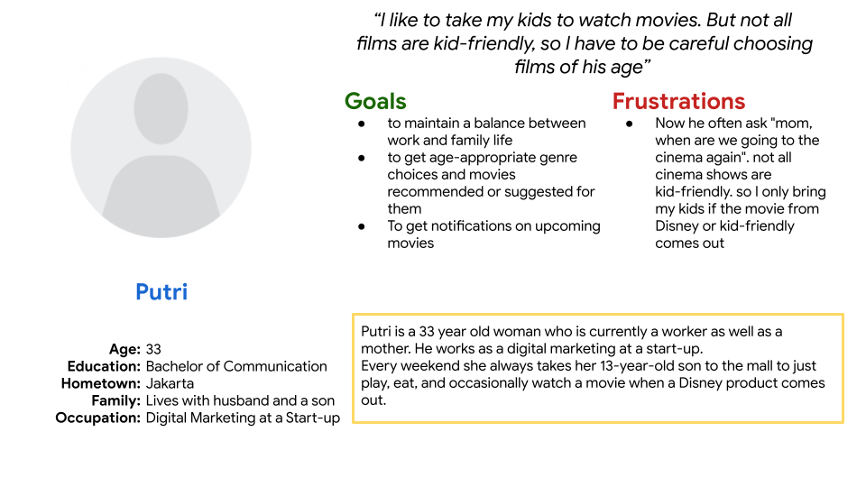
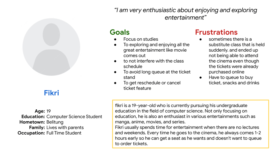
User Persona
Competitive Audit

STARTING THE DESIGN
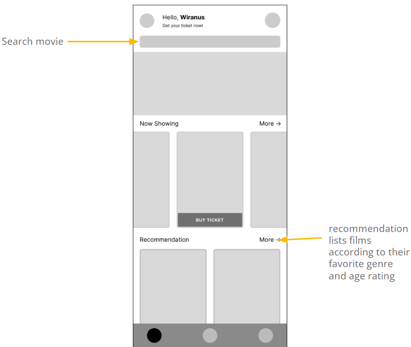
Digital Wireframes
Low-Fidelity Prototype
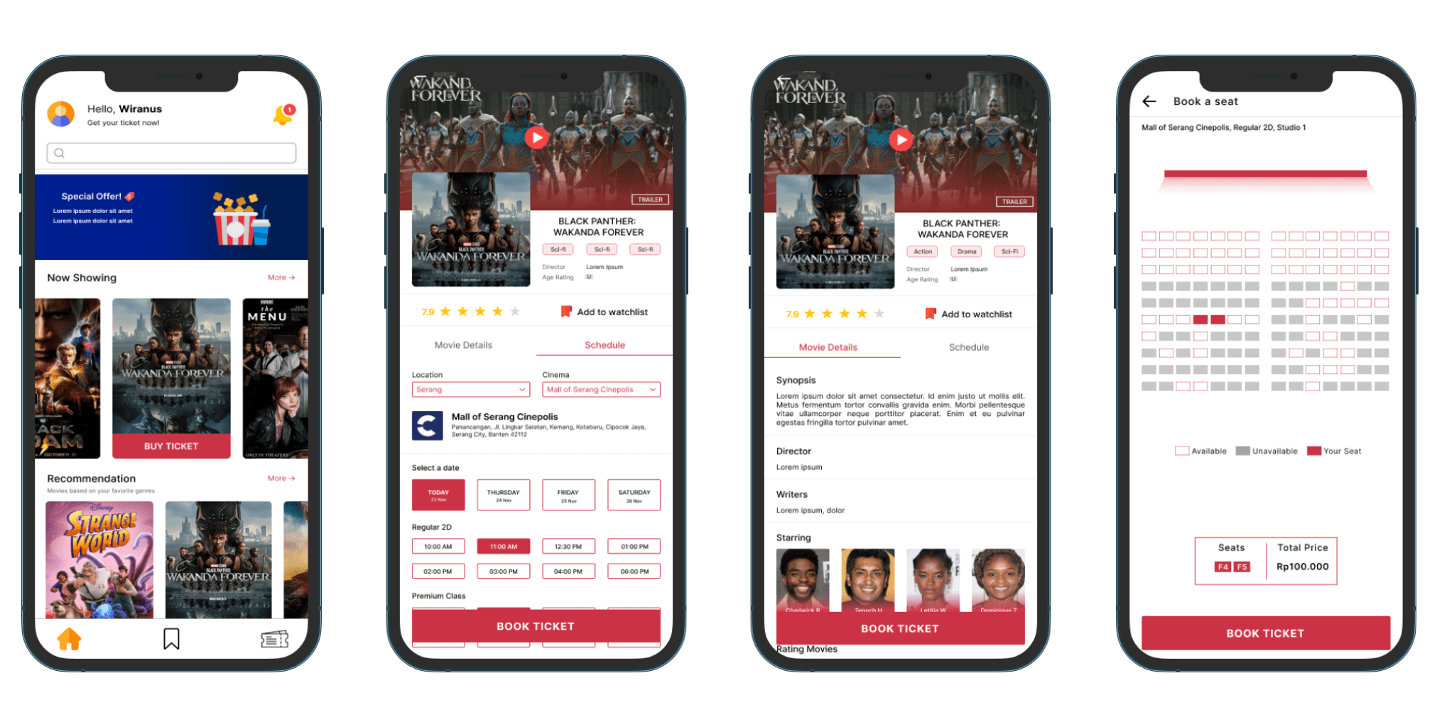
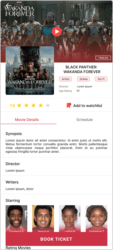
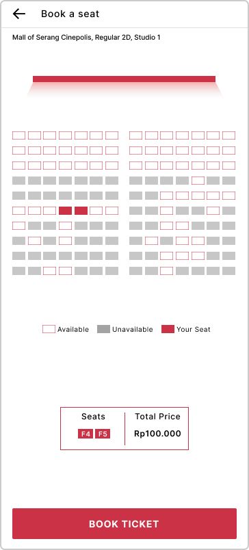
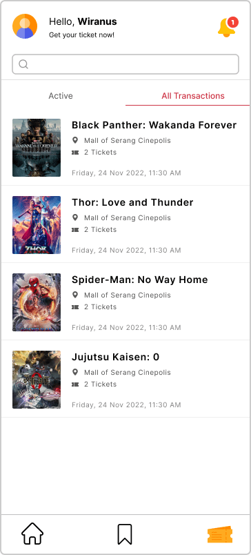
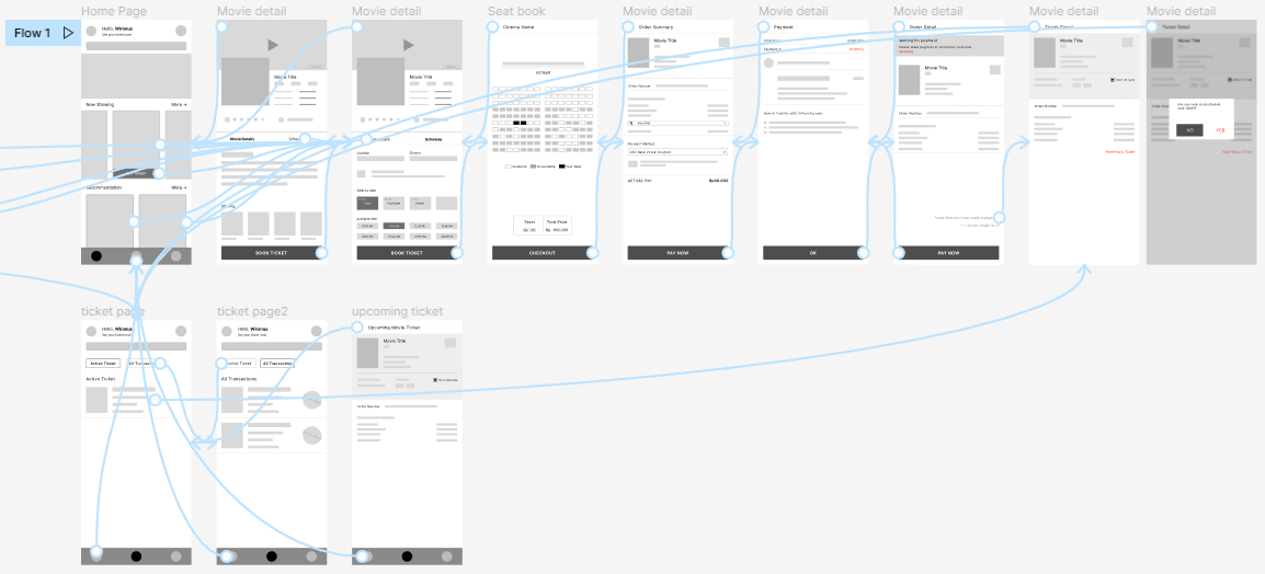
Using the completed set of digital wireframes, I created a low-fidelity prototype. The primary user flow I connected is on the main page, on the main page the user will see the film that is currently showing and recommendations for the film that is currently showing, then choose one of the films to watch according to the film that is currently showing and carry out the booking process.
click here to try Low-Fidelity Prototype
Usability Study: Parameters
- Study Type: Unmoderated Usability Study
- Participants: 5 Participants
- Location: Indonesia
- Length: 15-20 Minutes
Usability Study: findings
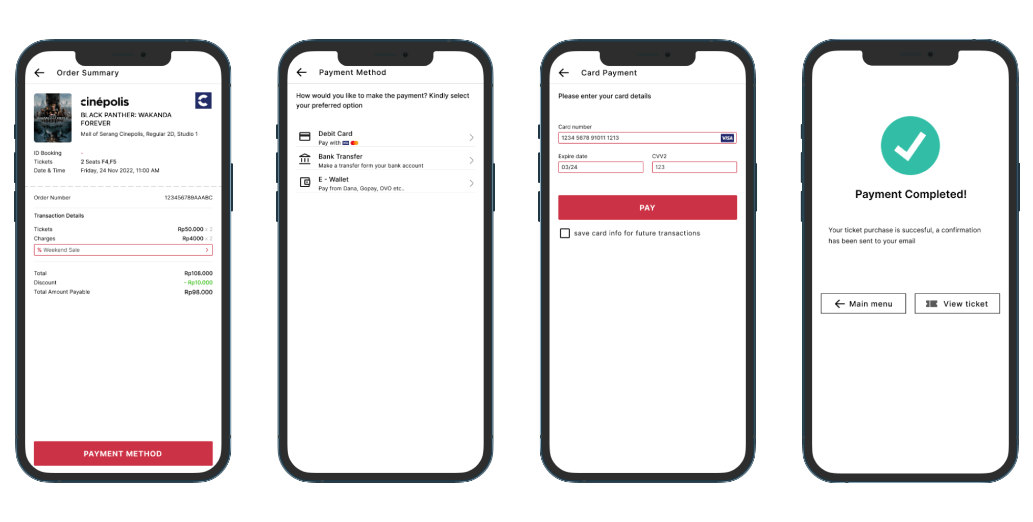
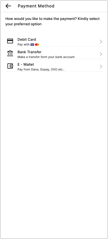
- Payment Method, Users want more payment method option
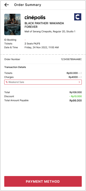
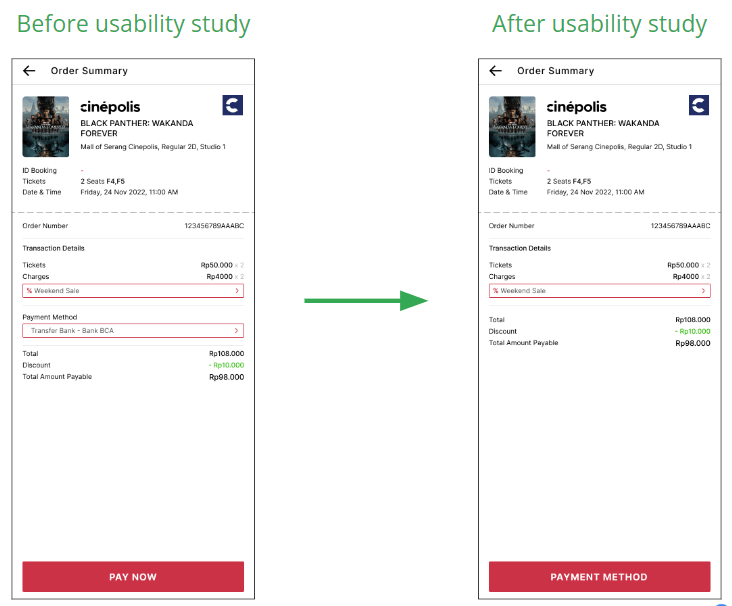
- Checkout, the checkout process has too many unnecessary steps at once
REFINING THE DESIGN
Refine
Changed the payment method selection button
Mockups
High Fidelity Prototype
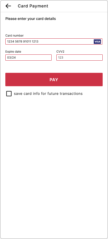
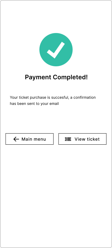
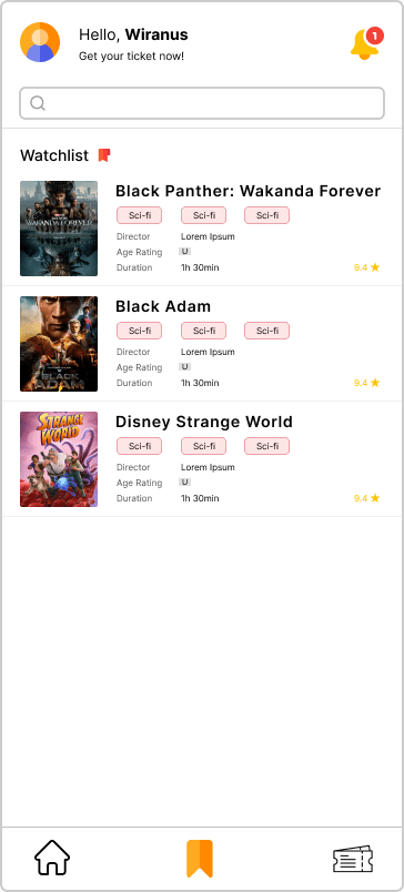
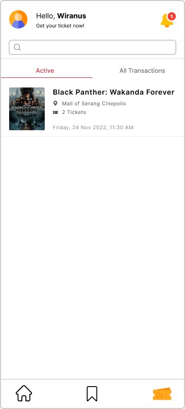
The final high-fidelity prototype presented cleaner user flows for booking ticket. it also met the user needs for easy navigation back and forth on the app
Click here to try Prototype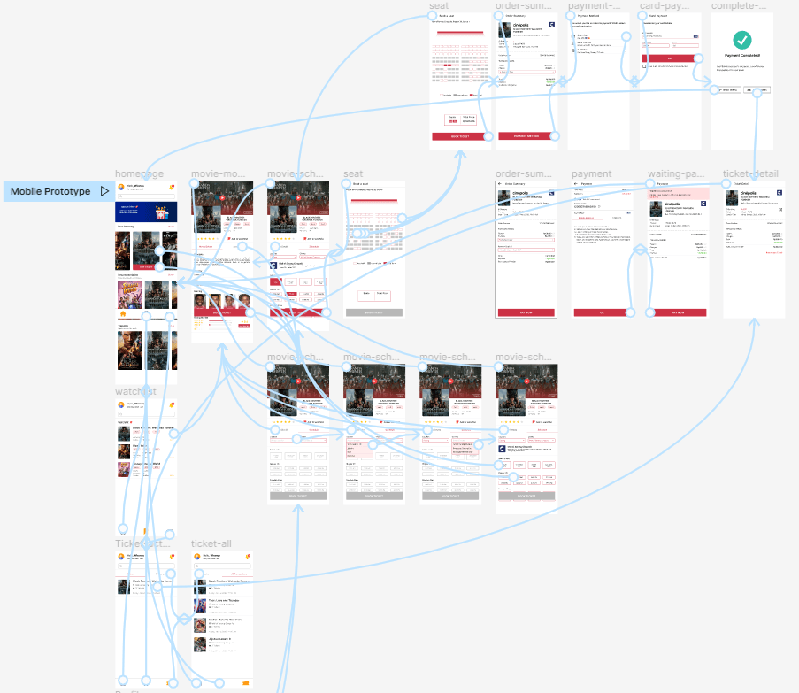
Accesibilty Consideration
- Used icons to help make navigations easy to understand
- provided access to users who are vision impaired through making the app suitable for use with screen readers
RESPONSIVE DESIGN
Sitemap
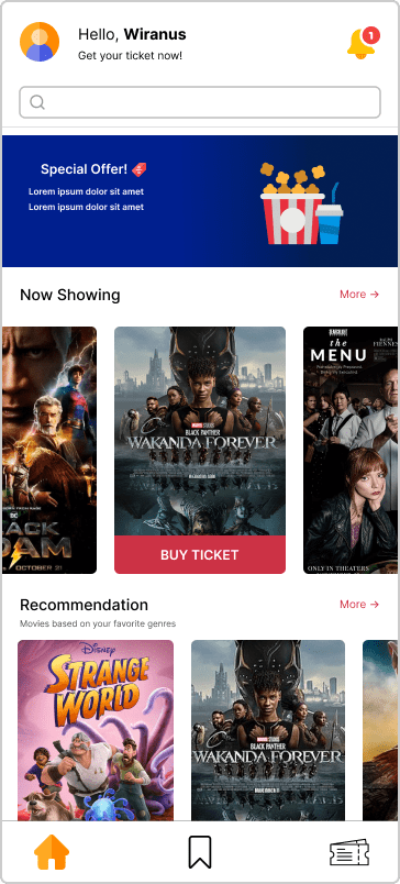
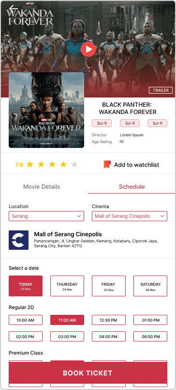
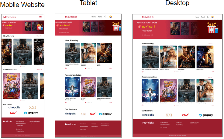
Responsive Design
GOING FORWARD
Impact
The app makes users feel like the booking movie ticket app really thinks about how to meet their needs and easy to use. one quote from user feedback
It's very easy, I can immediately use this app with one try
Fikri
Student
What I Learned
while designing the app, I learned that the first few idea might not be the final ones. The feedback from peer reviews and the usability studies really influenced the final design
Next Steps
- Conduct more user research to determine any new areas of need
- Conduct another round of usability studies to validate whether the pain points users experienced have been effectively addressed
Project information
- Project Duration November 2022 - Desember 2022
- Role UX Researcher, UX Designer, UI Designer
- Responsibilities Conducting interviews, paper and digital wireframing, low and high-fidelity prototyping, conducting usability studies, accounting for accessibility and iterating on designs
- Try Prototype

