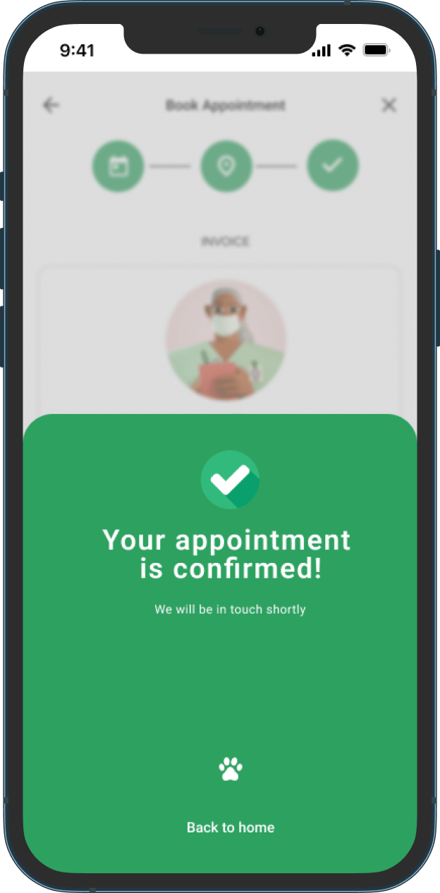
Grooming App
Pet Grooming Salon Appointment Mobile App
PROJECT OVERVIEW
The Product
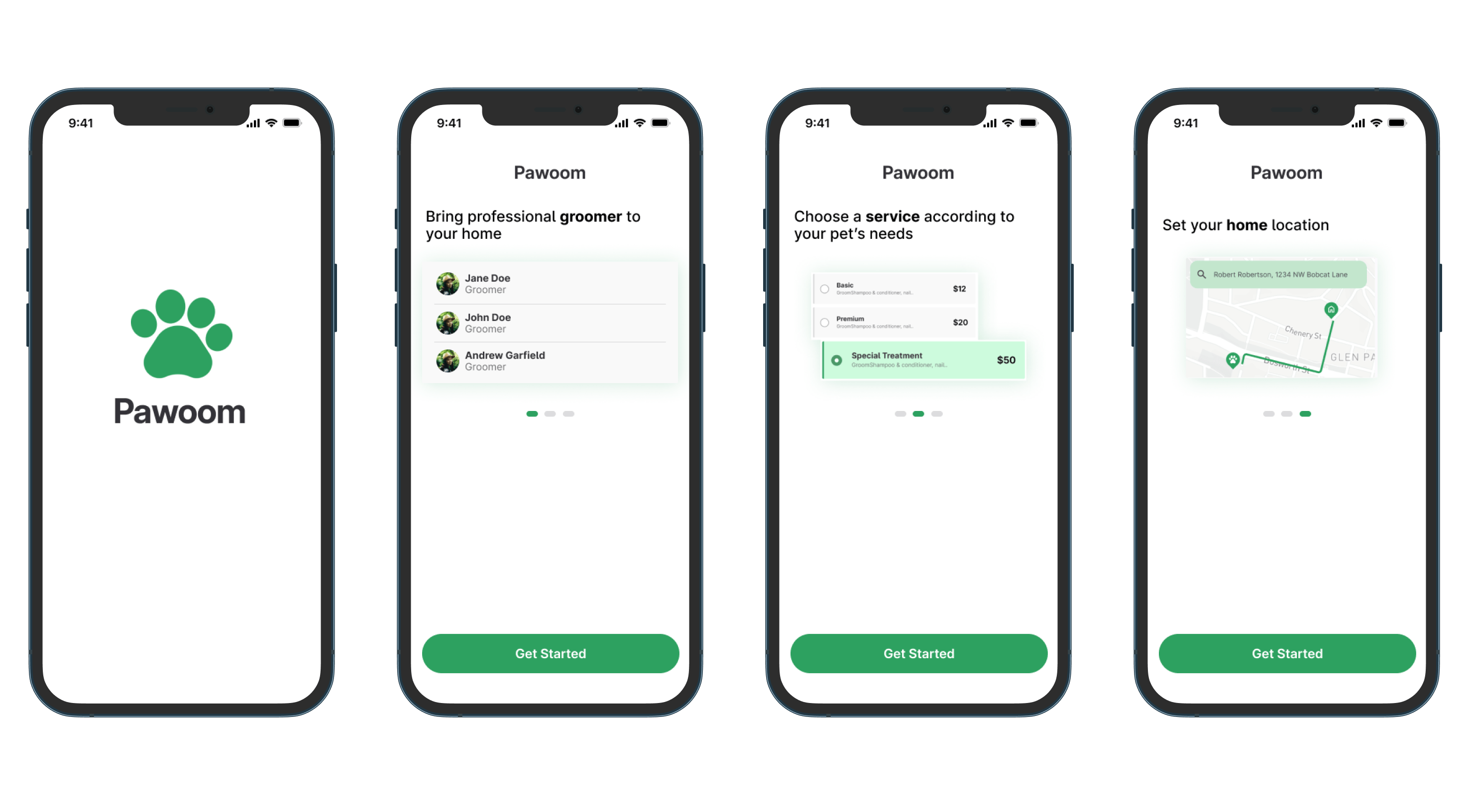
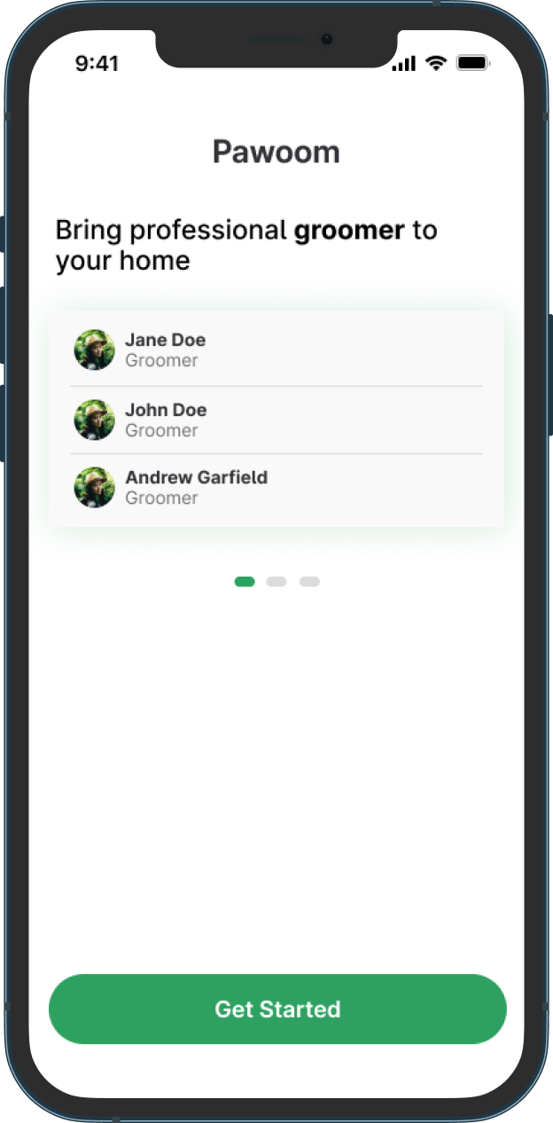
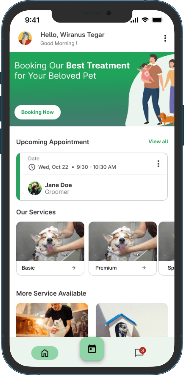
Pawoom is a Pet Grooming Appointment Mobile App for booking appointment groomer to treat customers’ pet. Users can book various types service available. The target users of this application are adults which makes it easy for them to treat their pet properly with professional groomer.
The Problem
Pet owners have a hard time finding a pet salon or groomer that they like. Most pet owners also experience problems with time, having little free time because their busy lives make their pets a bit unkempt.
UNDERSTANDING THE USER
User Research: Summary
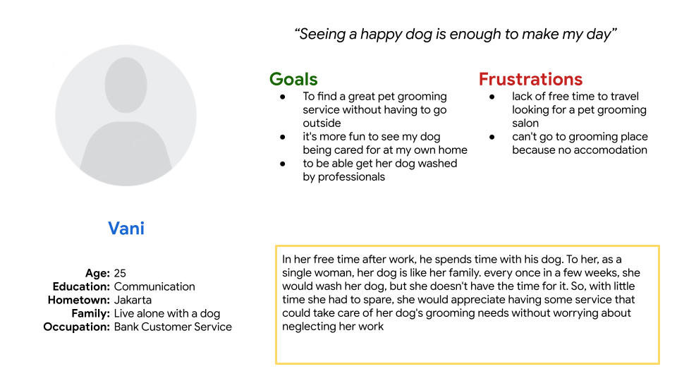
I conducted interviews and created empathy maps to understand the users I’m designing for and their needs. A primary user group identified through research was adults worker who want to take care of their beloved pets by grooming salon by professional groomers. Most pet owners have busy jobs so they don't have much time to go to the groomer's salon. busyness is not the only factor for users, they also have reasons such as not having accommodation to go outside with their pets, then they also want to feel that their pets are cared for at home by calling their groomer to their place.
User Research: Pain Points
- Time, working adults are too busy to looking for grooming salon
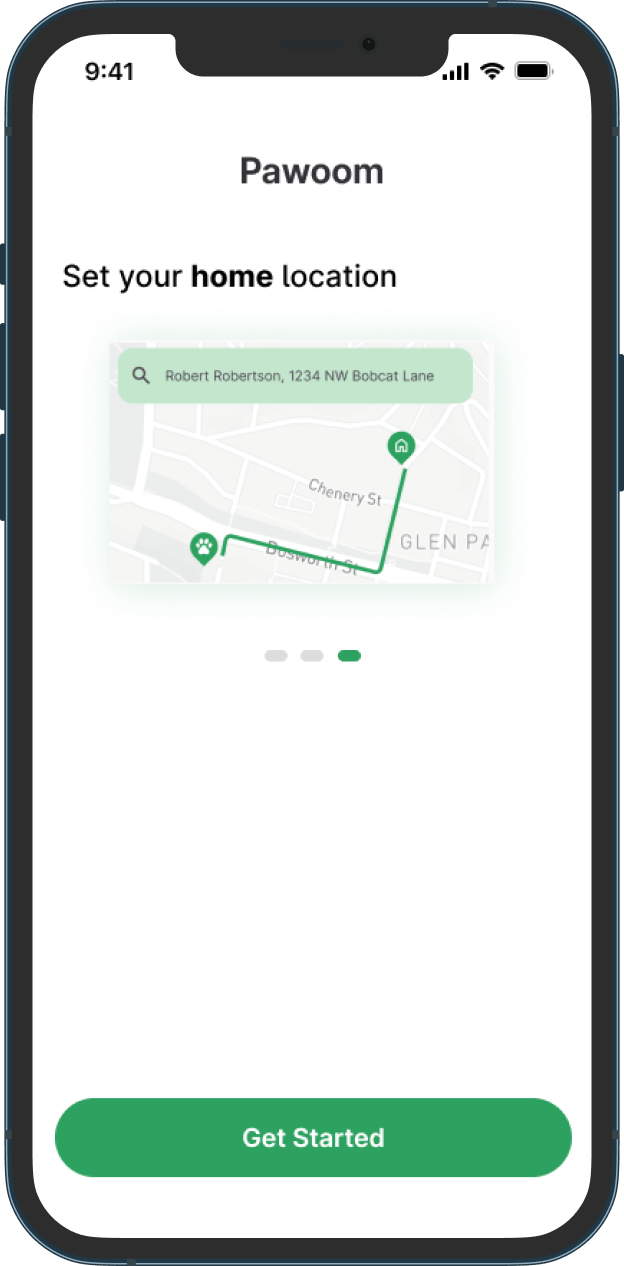
- Location, Some pet owners don’t know where to find grooming salonn
- Accomodation, Some pet owners do not have the accommodations to take their pets out to grooming salons
User Persona
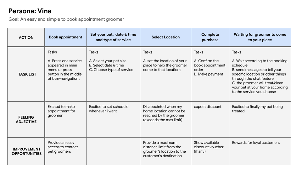
User Journey Map
STARTING THE DESIGN
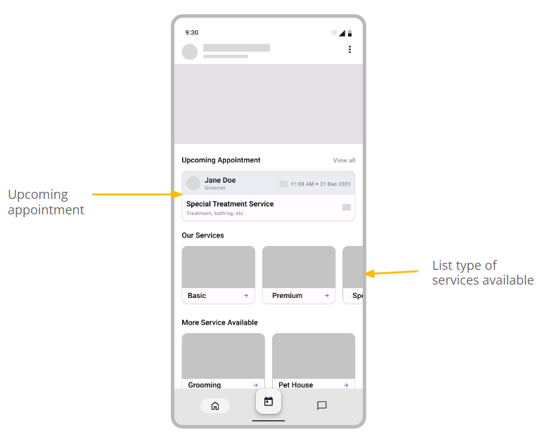
Digital Wireframes
Low-Fidelity Prototype
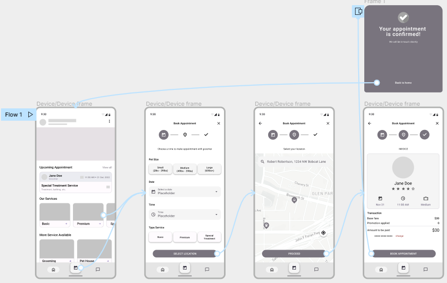
Using the completed set of digital wireframes, I created a low-fidelity prototype. The primary user flow I connected is on the main page, on the main page the user will see the film that is currently showing and recommendations for the film that is currently showing, then choose one of the films to watch according to the film that is currently showing and carry out the booking process.
click here to try Low-Fidelity Prototype
Usability Study: Parameters
- Study Type: Unmoderated Usability Study
- Participants: 2 Participants
- Location: Indonesia
- Length: 10-15 Minutes
Usability Study: findings
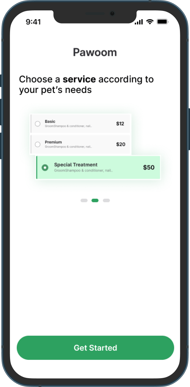
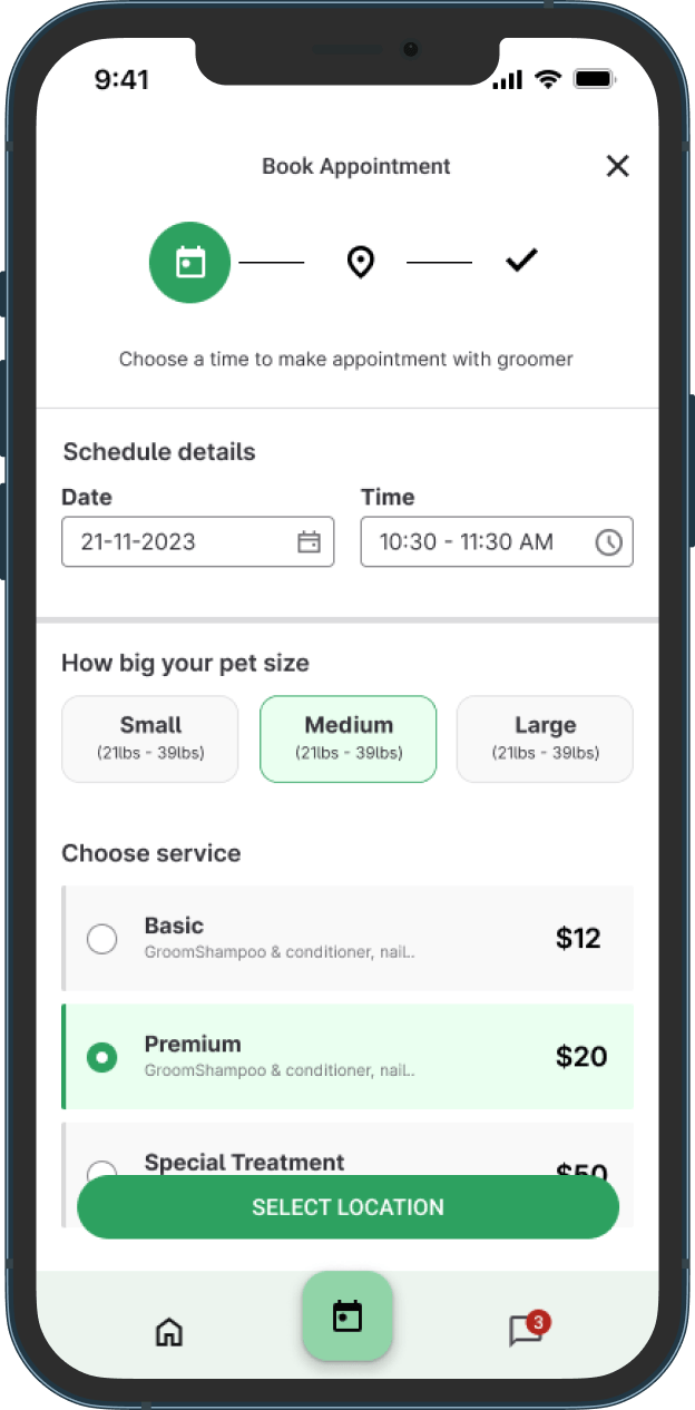
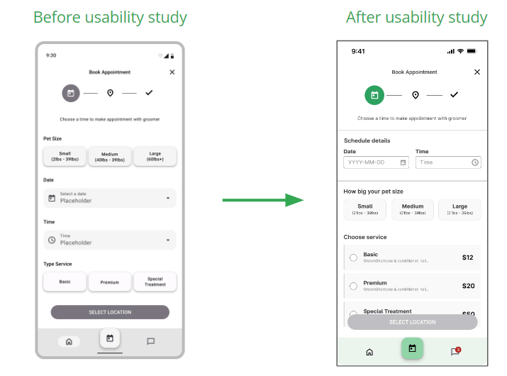
- Users want to see the price of each service during the booking process
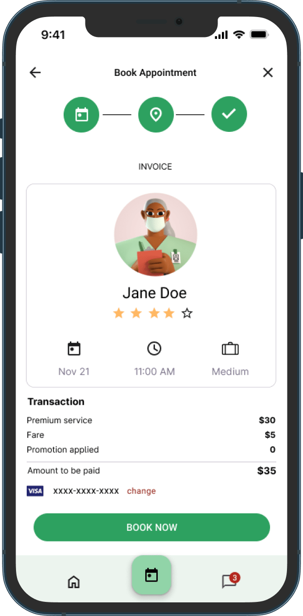
- Users want more payment method option
REFINING THE DESIGN
Refine
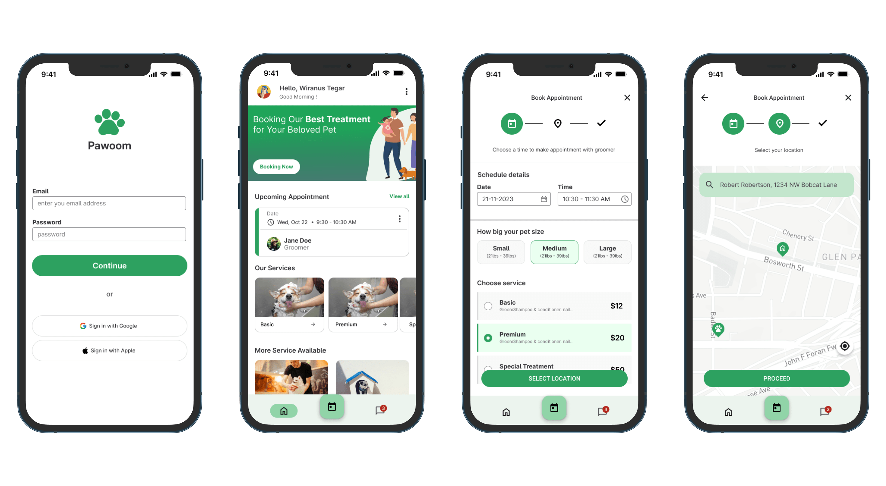
changed the type of service selection button
Mockups
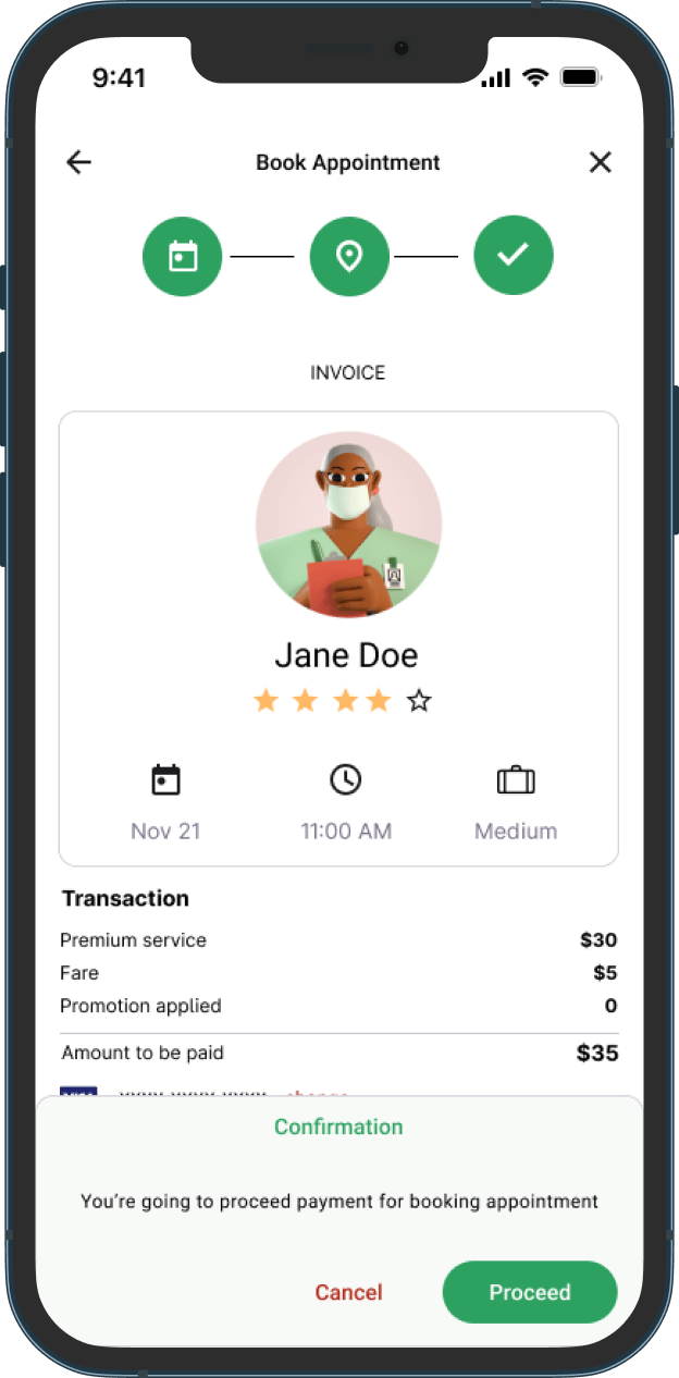
High Fidelity Prototype
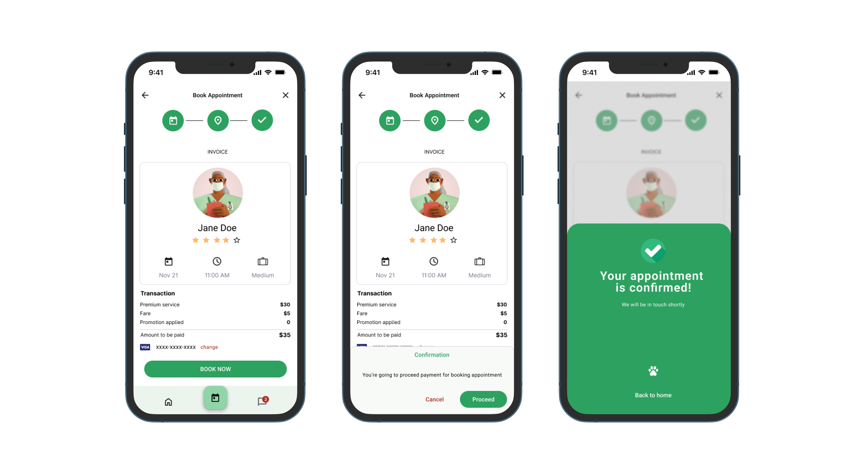
The final high-fidelity prototype presented cleaner user flows for booking ticket. it also met the user needs for easy navigation back and forth on the app
Click here to try Prototype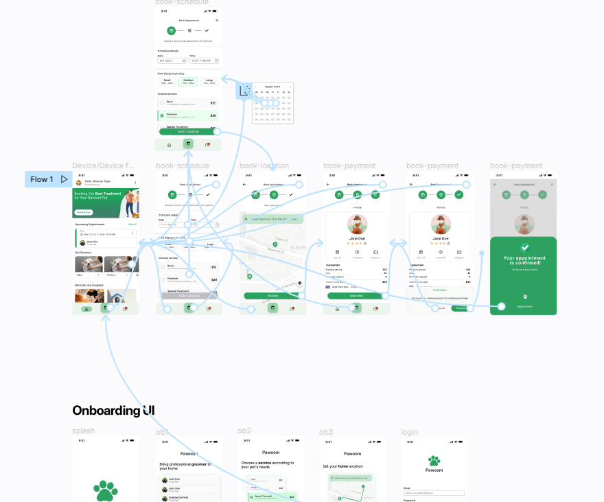
Project information
- Project Duration October 2022
- Role UX Researcher, UX Designer, UI Designer
- Responsibilities Conducting interviews, paper and digital wireframing, low and high-fidelity prototyping, conducting usability studies, accounting for accessibility and iterating on designs
- Try Prototype

